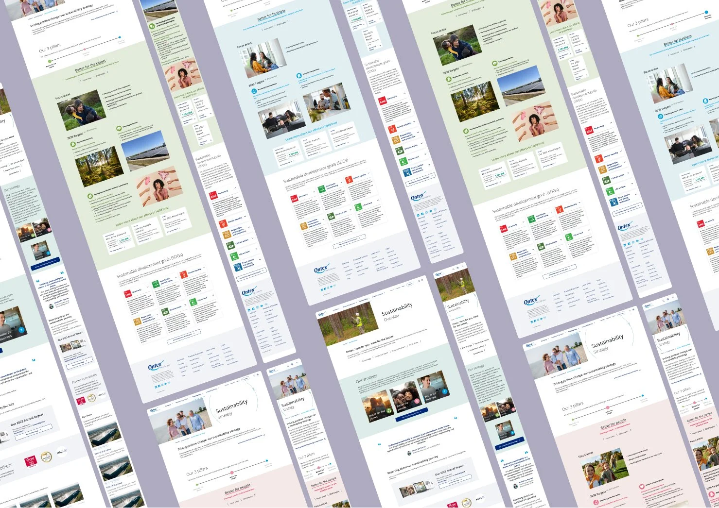
ONTEX CORPORATE WEBSITE - SUSTAINABILITY
Year of this project: 2024 Device: Desktop and mobile Tasks performed: Workshop, wireframes, challenging brand identity to have accessible colors, and UX/UI design refont of the section Tools: Figma and Figjam
For this project, I was asked to redesign the sustainability section of the Ontex Corporate website and include eco-friendly design principles.
I worked on this project alongside my colleague Carine Amani, and together we created a strong, user-friendly design
Since the Ontex brand identity was changing at the same time, we updated the new designs to match. We also made sure that all important brand colors were accessible, which involved working closely with the team to agree on the right color options for the website.
If you wish to know a little more, scroll down for a quick step to step recap of the project process!
Step 1. Audit of the actual website
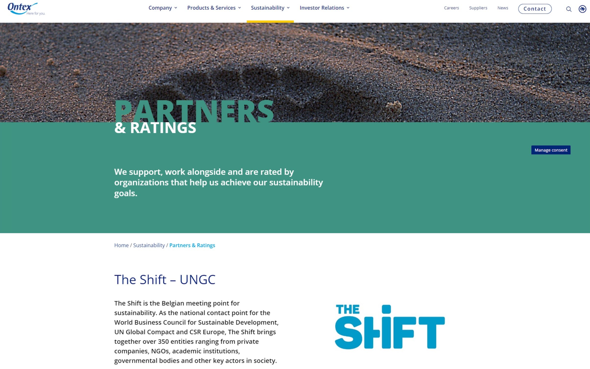
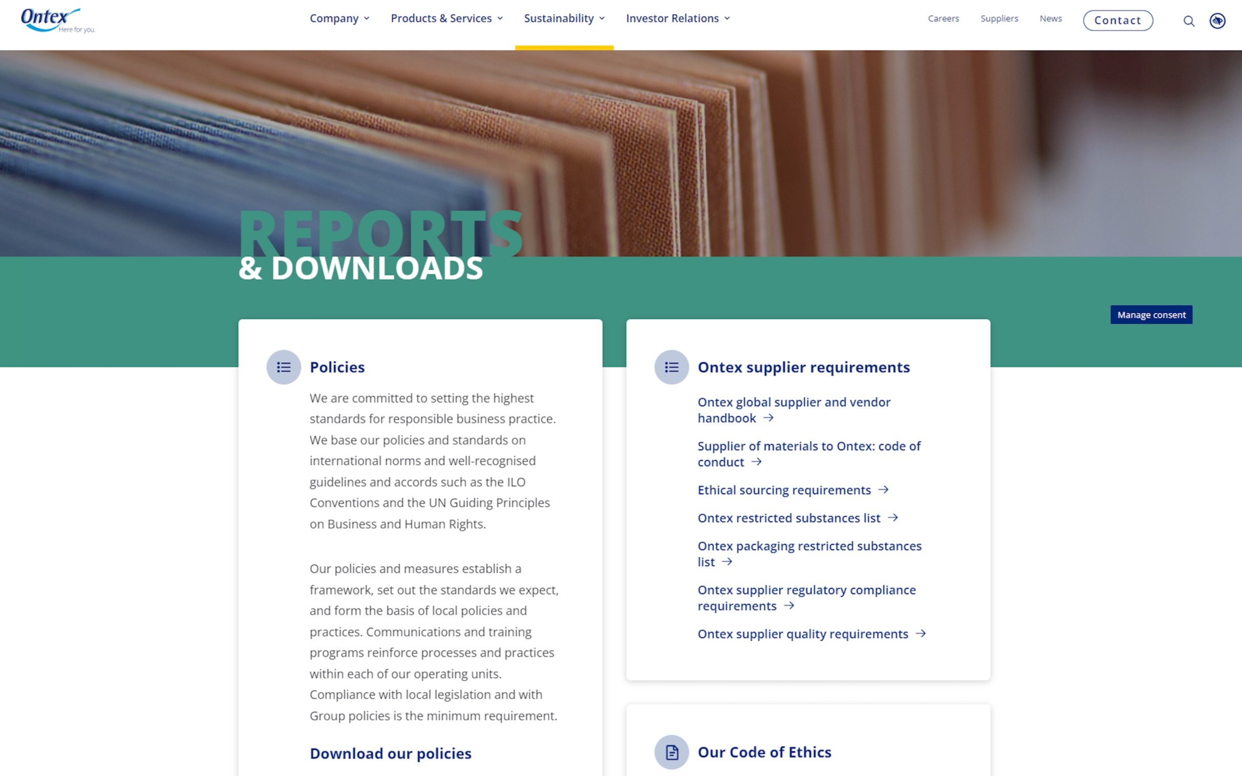
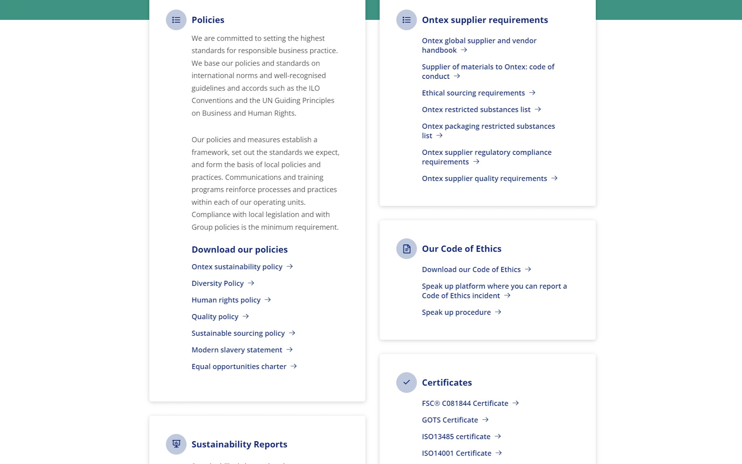
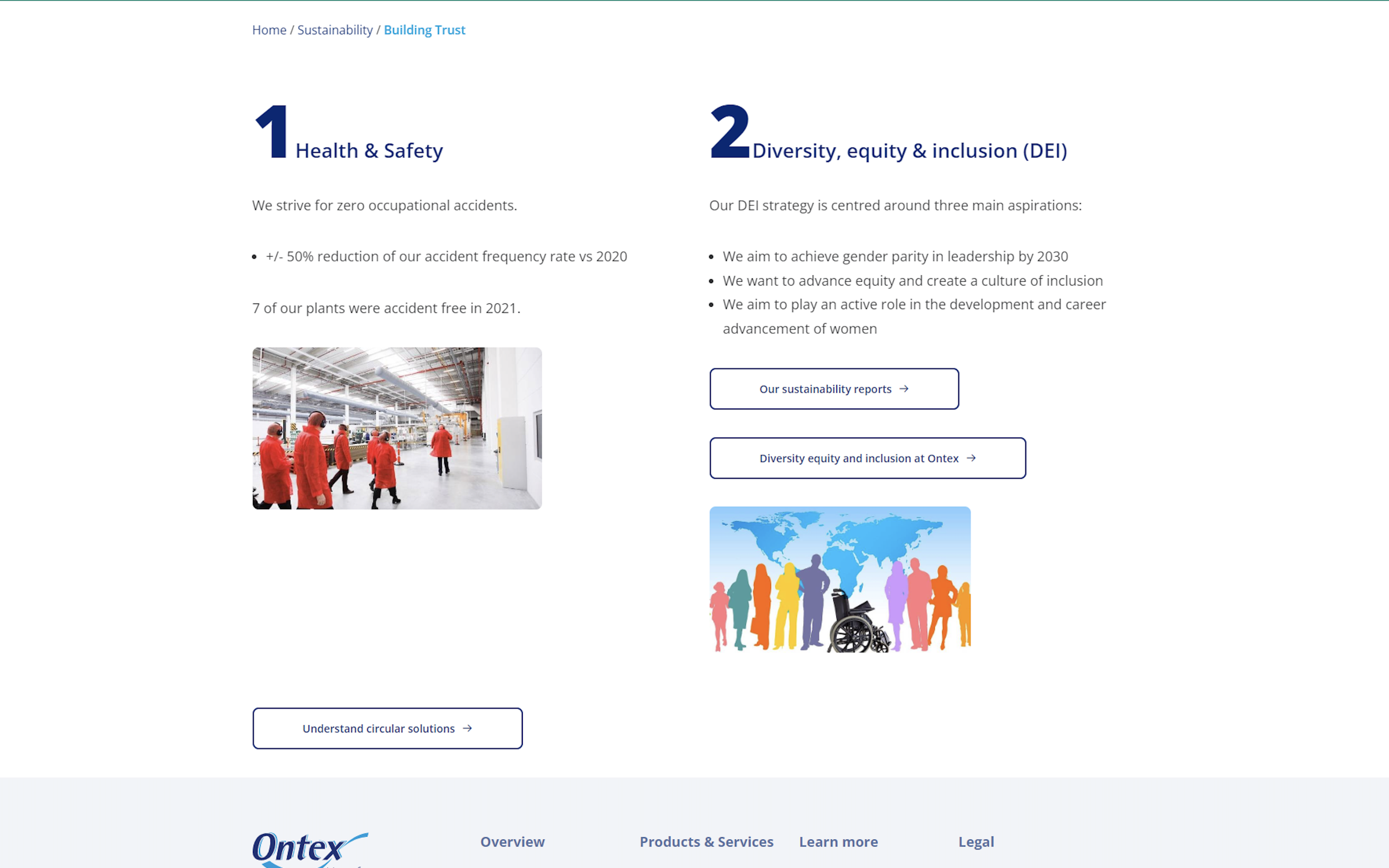
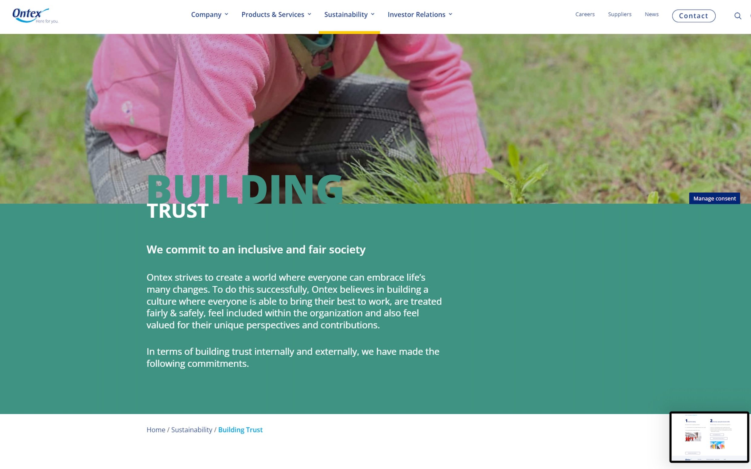
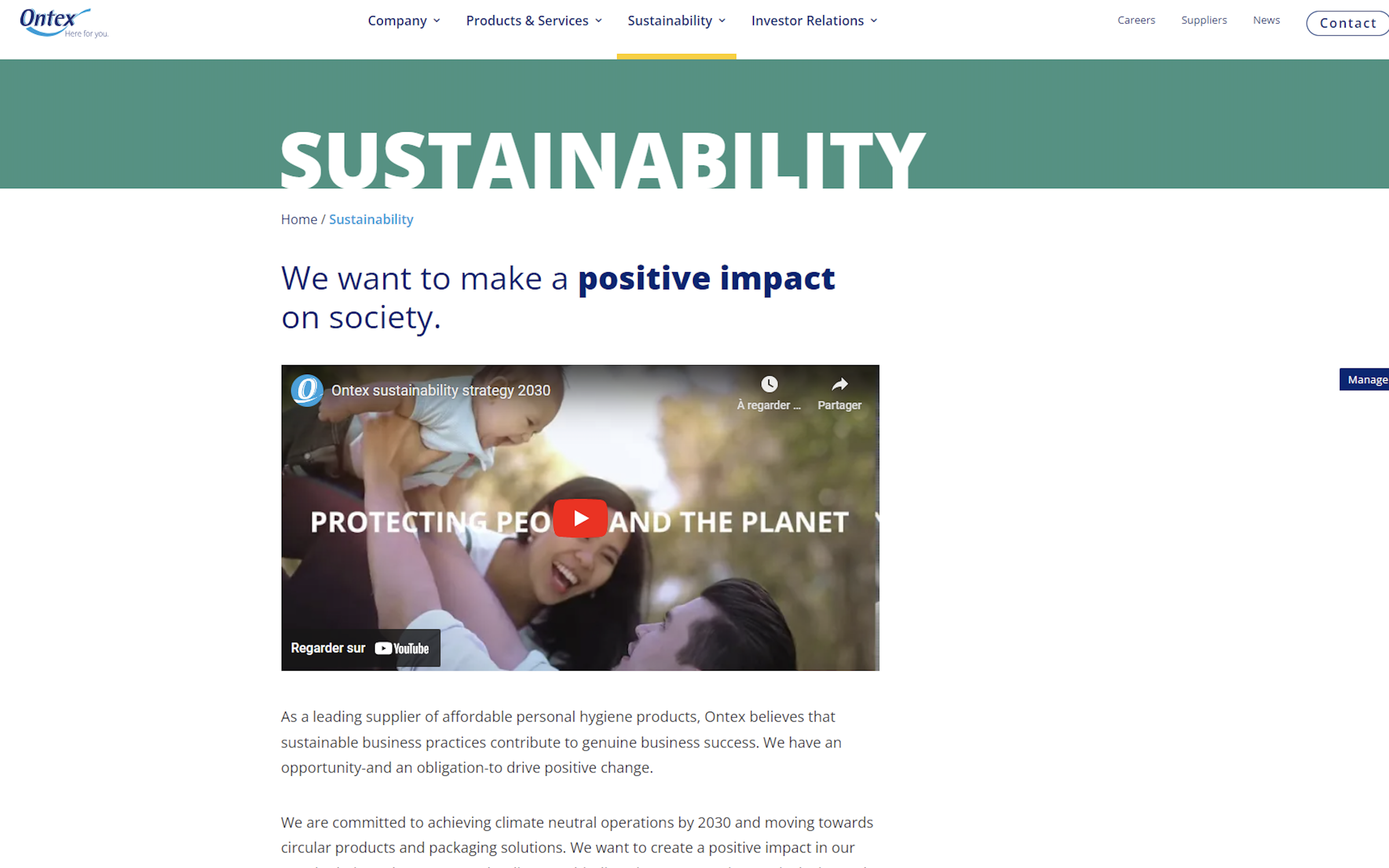
The first step of this project was to conduct an audit of the existing section on the Ontex Corporate website. ( You can find some screenshots from the old pages below.)
During this review, we identified several issues:
There were numerous pages, some with minimal content. ( 16 pages)
Our analysis of the website's SEO performance showed that many of these pages had low traffic, indicating that they might not all be necessary.
Lastly, we noticed a significant number of tables in this section, which would be challenging to redesign and recode within the project’s timeline.
As mentioned before, we aimed to redesign this section with eco-conception in mind, following the principle of "less is best".
Following the audit, we identified a few key questions:
Who is the core audience for the Ontex sustainability pages?
Can we reduce the number of pages or consolidate some of them?
What sections or information are essential for this part of the website?
Step 2. Workshop with the sustainability team
To ensure alignment with the sustainability team and communicate our eco-friendly approach, we organized a workshop.
During the session, we were able to ask key questions about what information, pages, and sections were essential for the website.
With the insights gathered, we also created preliminary sketches to visualize how the redesigned pages would look, incorporating the necessary content.
As a result of this workshop, we reduced the number of pages from 16 to 9.
Step 3. Wireframes
The next step was the wireframing stage.
Both Carine and I created different versions of each page to allow our creativity to flourish. We then presented these designs to the team, and through collaboration, we successfully merged our ideas into cohesive wireframes.
We then held multiple meetings to validate the wireframes, making several adjustments along the way.
This back-and-forth process ultimately led to a stronger final product, and I am very proud of the results we achieved together.
In the final step, we focused on applying the new brand identity to the wireframes.
This involved carefully integrating the updated visual elements, including color schemes, typography, and imagery, to ensure consistency with Ontex's evolving brand.
We aimed to enhance the user experience while reflecting the company’s commitment to sustainability.
The result is a visually appealing and cohesive design that effectively communicates Ontex’s values.
You can see the final result here: https://ontex.com/sustainability/
